Department of Energy
The United States Department of Energy is a government branch that handles US policies towards energy and addressing toxic nuclear materials. Recently it has been making handlines as the forefront department that is trying to tackle climate change.
"Confusing navigation, clustered information...
No thank you! ☹️"
The reason for the redesign is simple. The currently outdated website and the lack of mobile applications are not how a government agency should run its platform! It can be better.
Project Description


Research
Interview
The bulk of the project emphasized the research portion. Because this was an official website, We needed to have enough data by talking to a government agent, meeting with frequent users, and looking into user records on how might we make this web platform better.
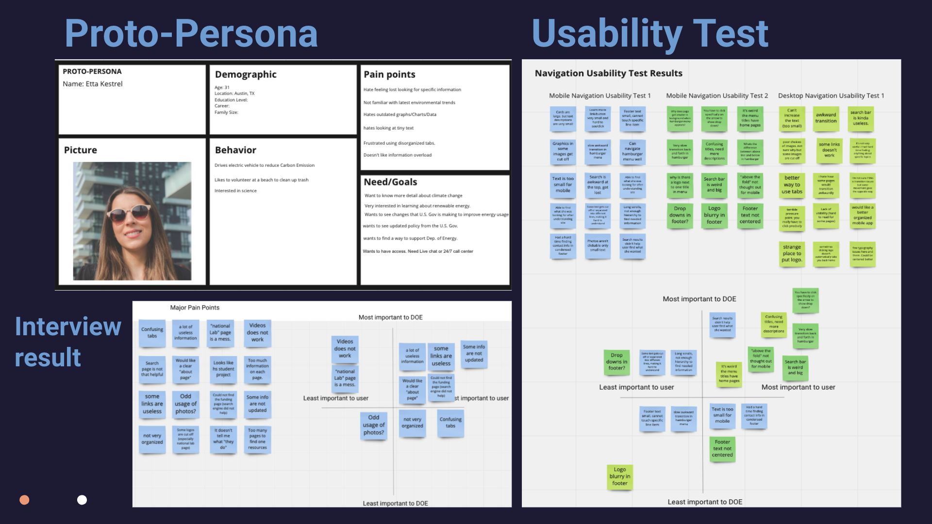
Empathy Map
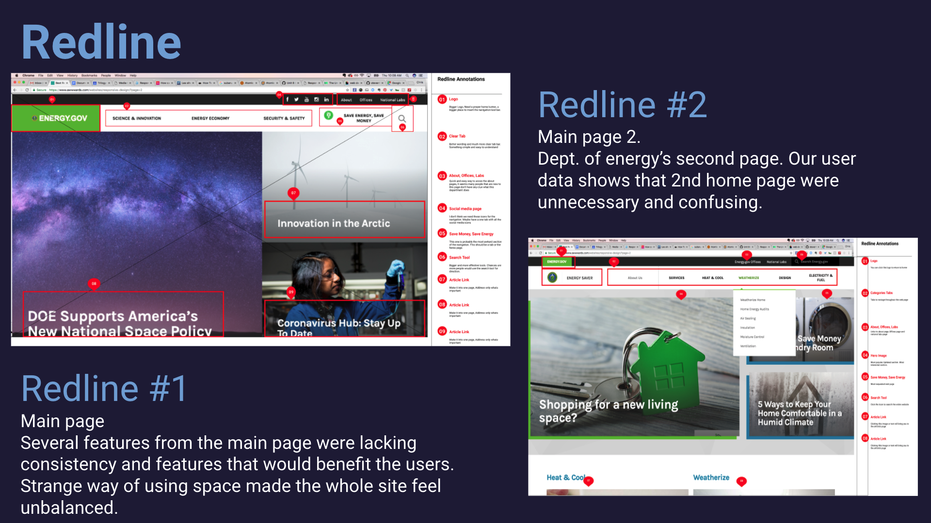
We conducted several usability tests using redlining method. We found several disappointing results including, broken links, several 404 error pages, and misleading information.
Redesign
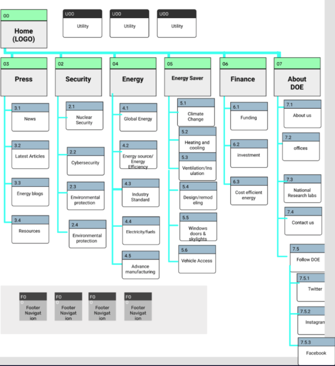
Card sorting/Site Map
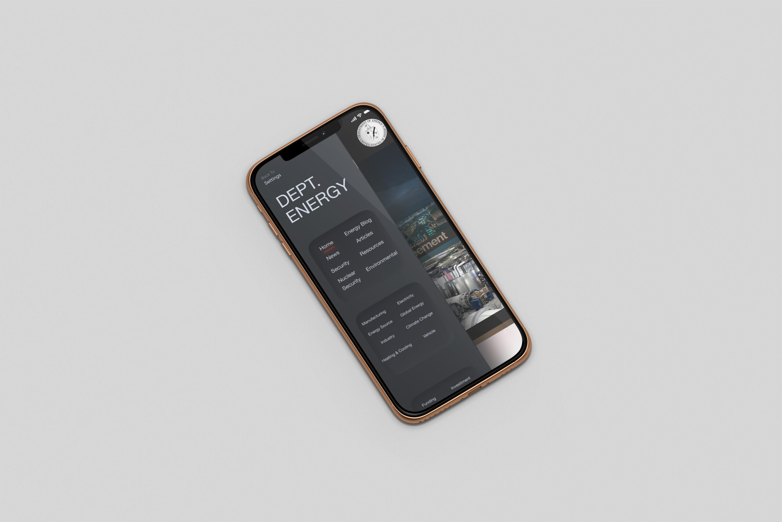
One of the earliest redesigns that we did was coming up with a new navbar. The previous navigation system had a confusing two main navbar that was confusing users.
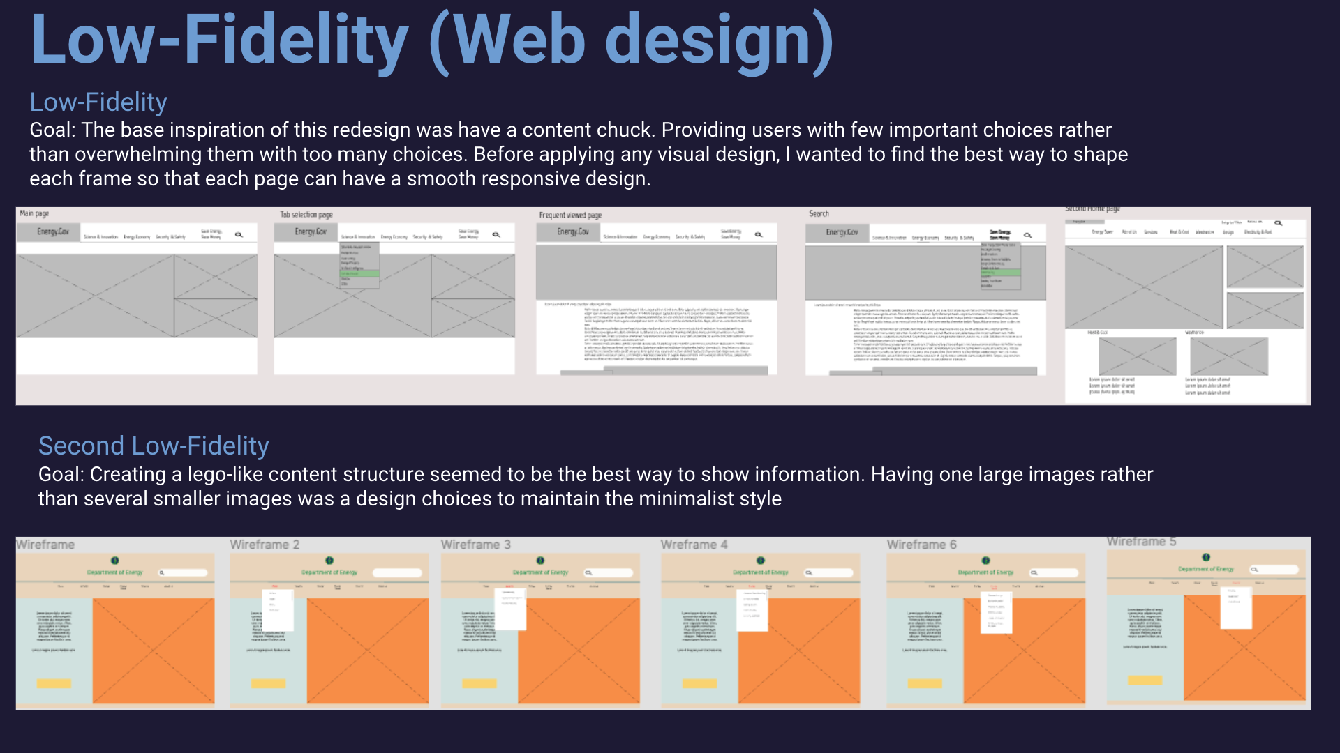
Low-fidelity sketch
Our sketch consists of a better way to showcase the information provided on the website. Most users felt that the current website was "overloaded" with meaningless visuals and not enough content that mattered, such as articles and news.
Style Guide
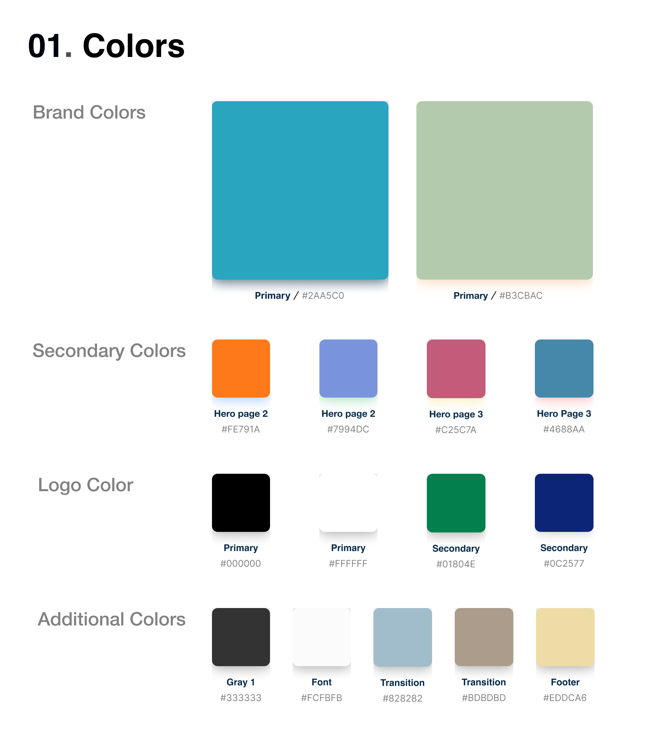
Color
Rather than reinviting the wheel, We kept the color of the original website as our brand color. From there, We added several new color palettes that would match the main color theme.
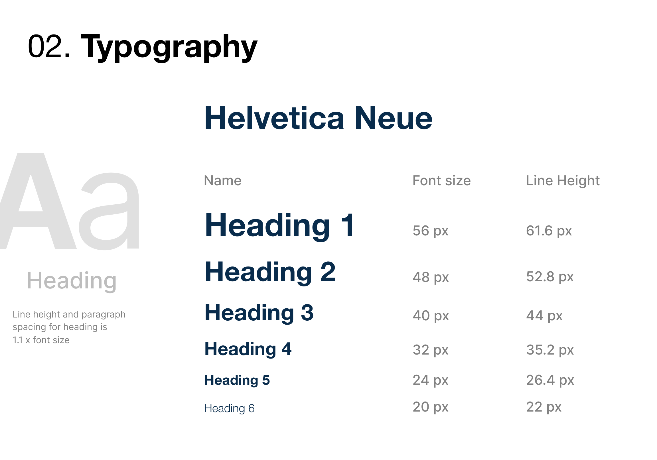
Typography
Because it's a government website, we didn't want to have the font become a distraction.
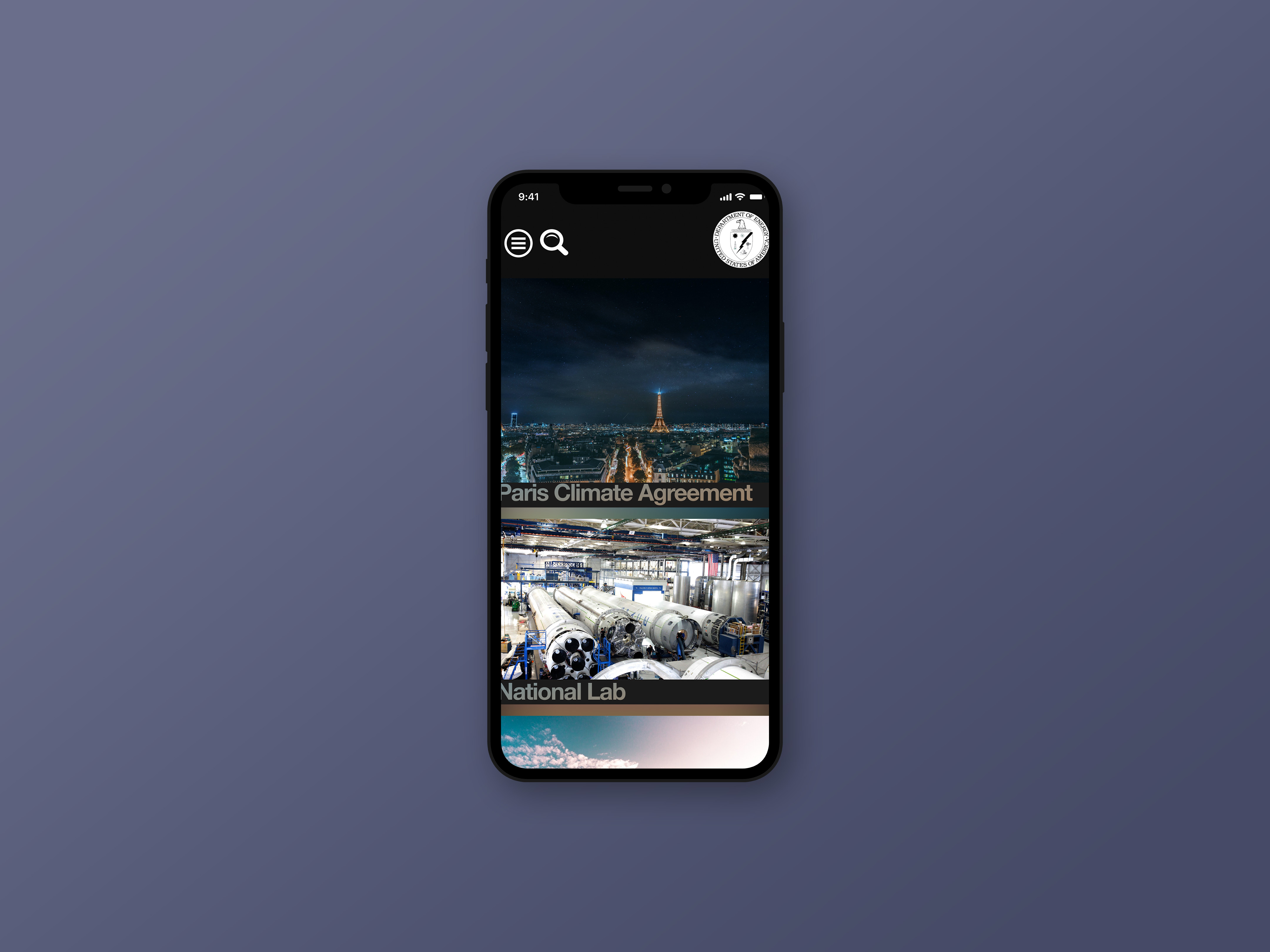
Responsive wireframe
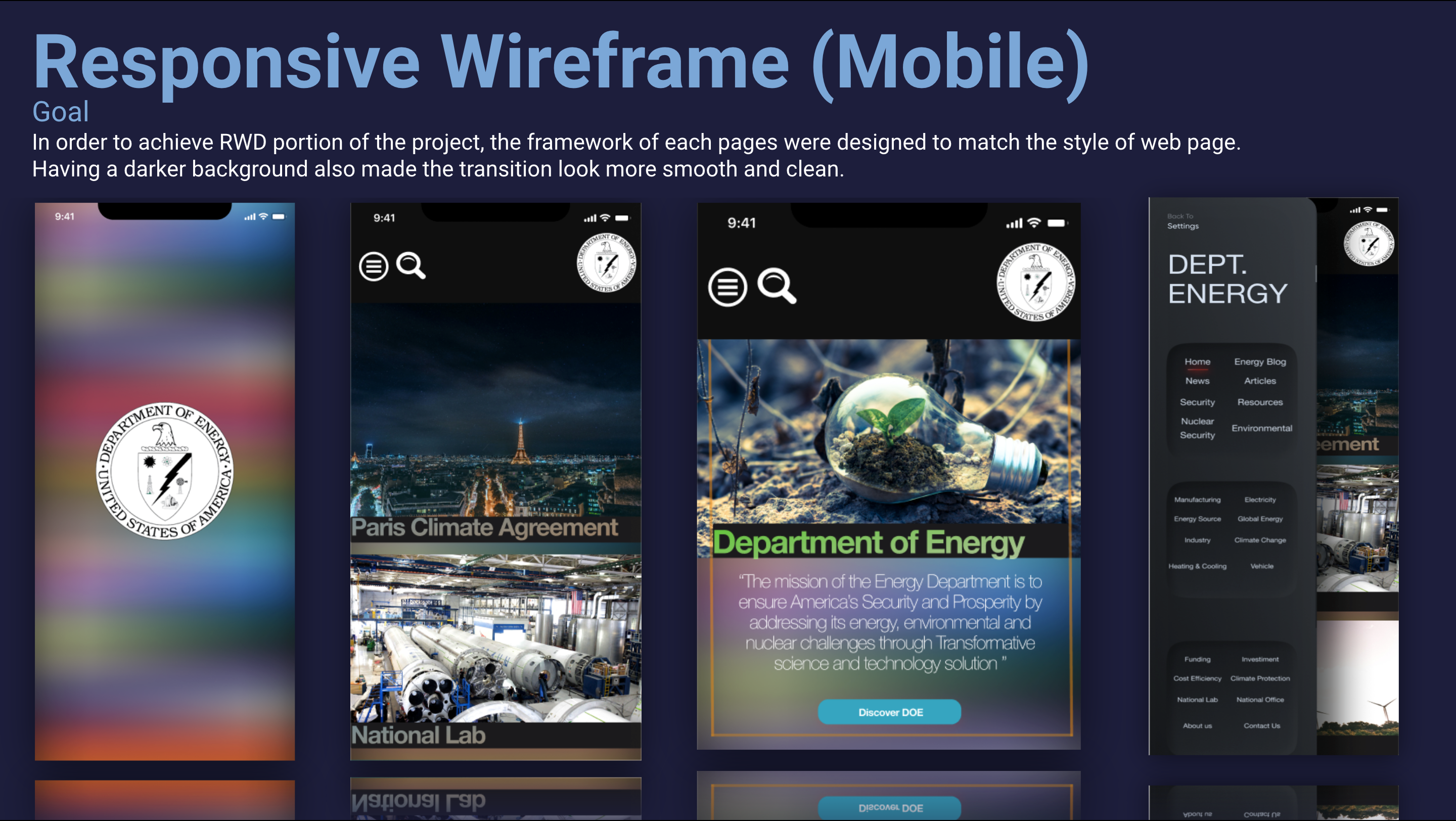
Mobile
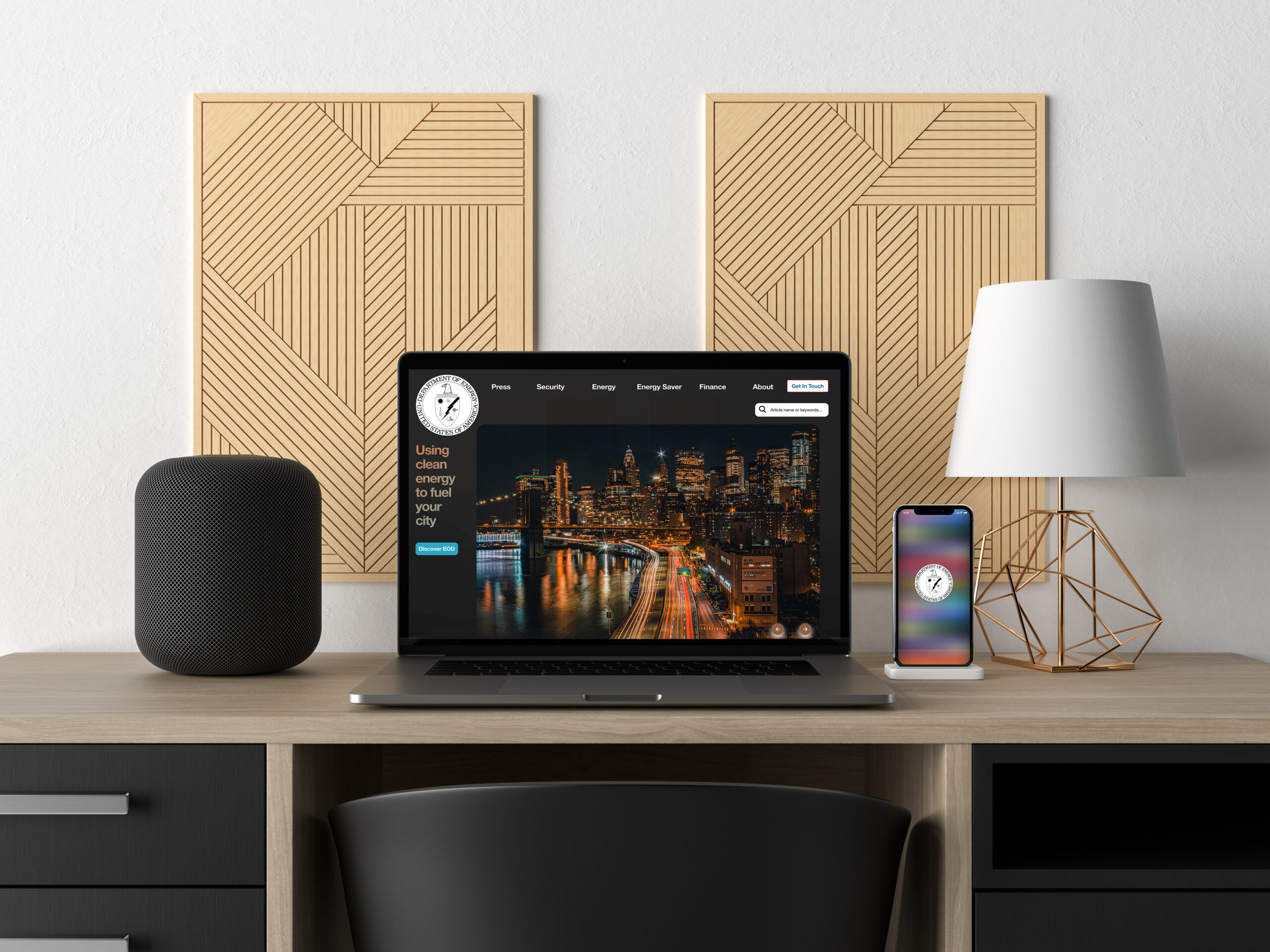
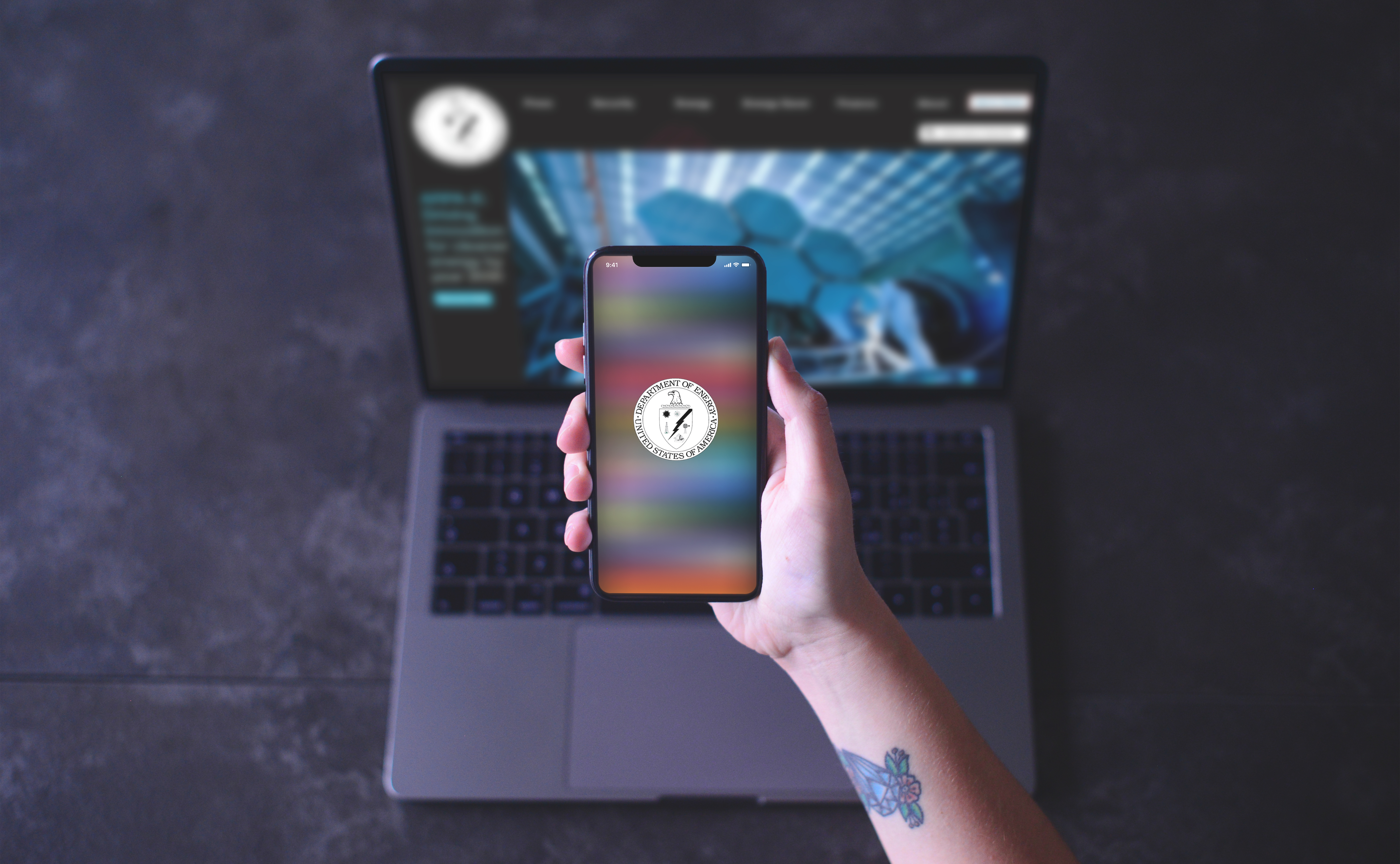
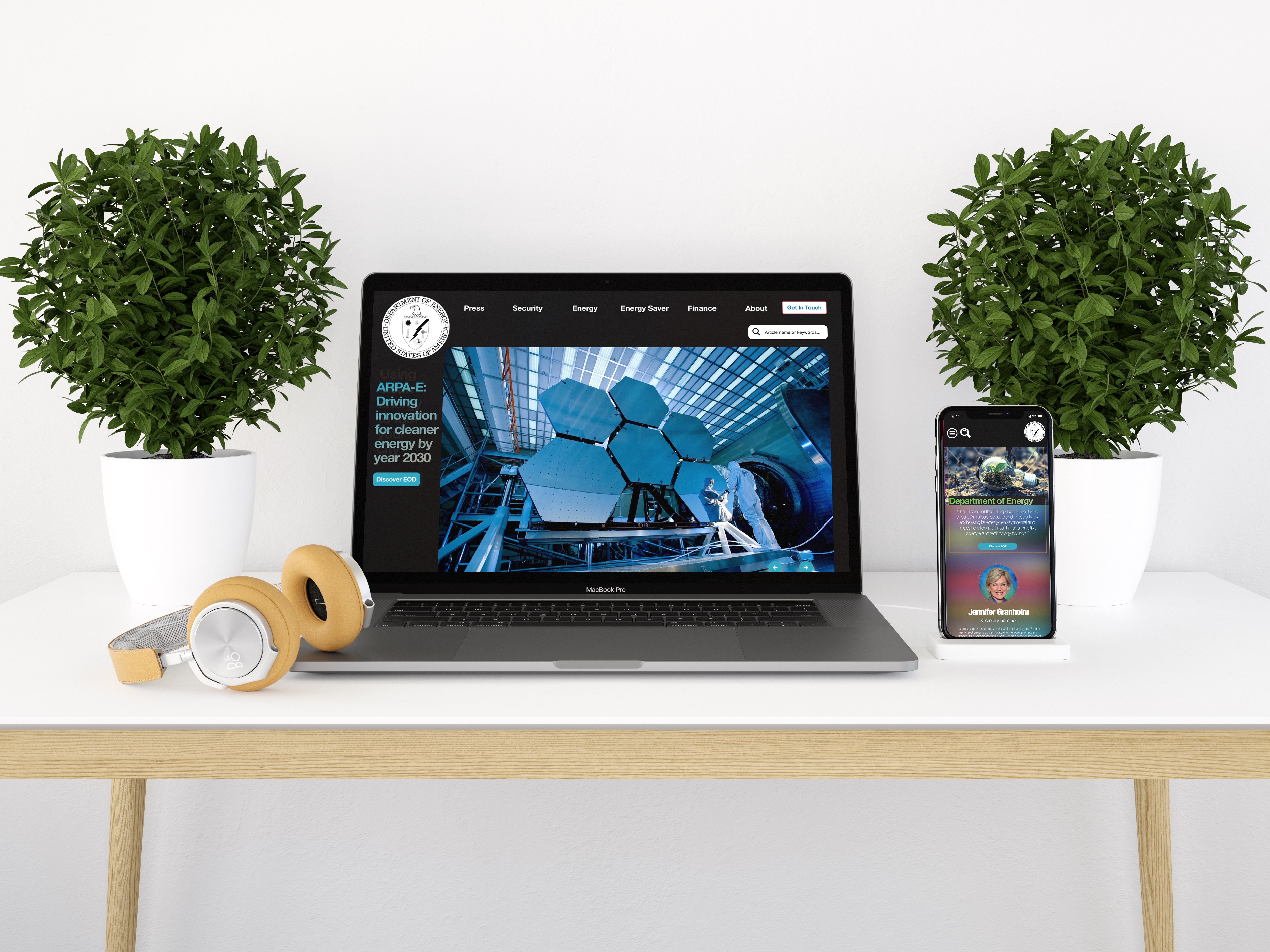
One thing we wanted to achieve in this redesign was the ability to be responsive. Because of Dept. Energy had a lack of mobile presence, we created both mobile and tablet versions of the design.
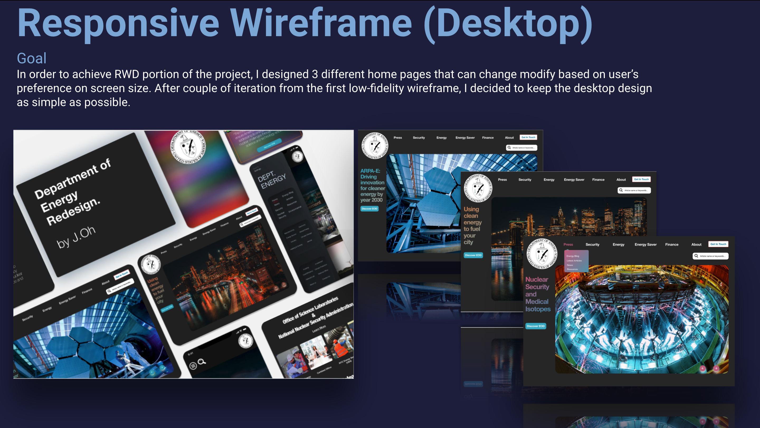
Desktop
As with the mobile, the Desktop version had several designs to match the screen length of any users.
Final Design
Final Thought